Add a Border to Simple List Section Images in Squarespace
Use Custom CSS to Add a Border to Simple List Section Images in Squarespace
Adding a border to the images in the simple list section of your Squarespace website is easy.
But before we dive in, I want to remind you that your website is much more than just its design. Ultimately your website's job is to attract and engage your target audience.
So don't get too hung up on the design. To learn more about how to attract and engage your target audience to your Squarespace website, check out my blog posts about how to draw in your ideal client and get actual eyes on this beautiful website that you are designing.
Watch me add a border to simple list section images in Squarespace ↓ or follow along in the easy step-by-step tutorial below.
Add a Simple List Section
When to Use a Simple List Section
The benefit of a simple list section is that everything in the simple list is always visible on the page in contrast to the ‘Banner slide show’ or ‘Carousel’ options which the visitor needs to scroll through in order to see all the content.
So just in case your visitor is quickly scrolling down your page, they're not going to miss any of your content when you use a simple list section layout.
But I do caution you that if you are going to use a simple list, don't have like 15 different items here. A simple list is good when you have a few items. And in my opinion, fewer is always better. People don't want to read a novel when they land on your website.
How to Add a Simple List Section
To add a simple list section to your Squarespace website, you're going to select ‘Add section.’
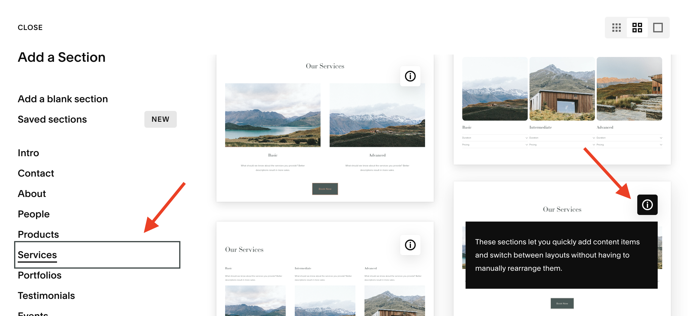
Squarespace doesn't make it easy to actually find a list section. Wouldn't it make sense if it was listed in the options panel as ‘List section?’ Well, as of today, May 31, 2024, it does not. You have to kind of search for it. So I typically start out in ‘Services.’
As you start to scroll, look for sections with the letter ‘i’ in the upper right corner. When you hover over the letter ‘i’ it actually says, “These sections let you quickly add content items and switch between layouts without having to manually rearrange them.” They really are great, and I use them a lot.
Just pick one. It doesn't really matter which one, because we're going to be changing it.
Now select Edit content > Design and from the dropdown options, select ‘Simple list.’
Add your content in the ‘Content’ tab and customize your design in the ‘Design’ tab until you get it just how you like it.
Add the Border to Your Simple List Section Images
Now all you have to do is add the border around these images. So to do that, you're going to go to Pages > Website tools > Custom CSS.
And then you're going to copy and paste the code snippet below right here.
/* Add a border to list section images */

SECTION ID GOES HERE .list-item-media-inner {
  border: 1px solid #000;
  display: block;
  border-radius: 0px;
  overflow: hidden;
}
For this next step. You're going to need the Squarespace ID finder Chrome extension. If you haven't installed this already, you need this, especially if you're planning to continue to use custom CSS on any of your Squarespace websites.
Once installed in your Chrome browser, select it. The identifier will shows you the section ID for this section of your webpage. Now all you have to do is select the section ID and it will automatically copy to the clipboard.
Now go back over to the code snippet and highlight where it says “SECTION ID GOES HERE” and paste your section ID.
And ta-da! Your border automatically is applied to the images in your simple list section.
Tweak the Code Snippet
Now, all you have to do is change your hex code to whatever color you want your border to be. You can even change the thickness of this border if you want. Play around with it until you get it how you like it.
I've included an option here for you to add a border radius. Right now it's set at zero, but if you want to add a border radius, all you have to do is add the pixels.
If you don’t know how to do these things, watch the video above where I show you exactly how to do this.
This page contains affiliate links


